Hands-On with Hex: A Deep Dive into an AI-First Analytics Platform
An in-depth, hands-on walkthrough of Hex — using live USGS earthquake data to go from plain-English questions to interactive maps, machine learning, and a shareable data app, all in one workflow.
Ben Jones · Founder, Powered By Data
Sponsored by Hex. This video is sponsored by Hex. In eight years of running Powered By Data, this is the first time we've partnered with a tool company — a reflection of how highly we think of what the Hex team is building.
In this hands-on walkthrough, Ben Jones of Powered By Data takes you inside Hex, an AI-first analytics platform built for modern data teams and business users.
Using live USGS earthquake data synced into a Supabase database, Ben shows how Hex can help people move from quick natural-language questions to deeper analysis, interactive maps, machine learning, and shareable data apps — all in one workflow.
In the demo, you'll see how Hex can be used to:
- Ask questions of your data in plain English with Threads
- Inspect the SQL and Python behind AI-generated answers
- Build a project with connected data, SQL cells, Python cells, and visualizations
- Use an agent-powered notebook to create charts, maps, and k-means clusters
- Build an earthquake proximity finder with city, radius, and date inputs
- Publish a polished app for business users
- Connect Hex with Claude Code
- Use Context Studio to improve accuracy, definitions, and trust in AI-assisted analytics

Why Hex, and why now
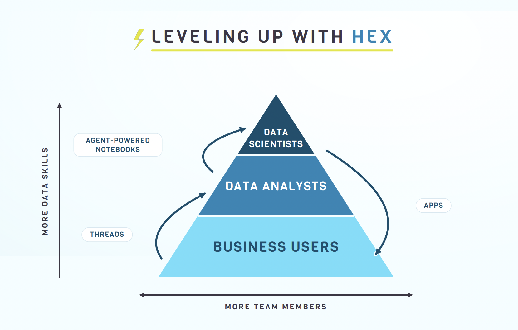
Think of every organization as a skill pyramid. At the top are data scientists; in the middle, data analysts who live in Tableau, Power BI, or Excel; and at the base, the many business users who make decisions with data but don't have specialized data skills.
What stands out about Hex is how its agents help each tier do more. Threads let business users perform tasks that normally fall to analysts. Agent-powered notebooks (Projects) let analysts take on work that used to require a data scientist. And published apps let data scientists and analysts communicate with — and build tools for — business users.
Threads — talk to your data first
The demo starts with the simplest possible interaction: just asking. With a Supabase table of magnitude-2.5+ earthquakes (refreshed hourly, going back to January 2025, ~41,000 records), a business user can ask for "the 10 largest earthquakes in the past year by location, magnitude, and depth" and get an answer — no ticket, no waiting on IT.
Crucially, the answer is inspectable. You can open the generated SQL, see exactly which table was queried and how results were ordered, then follow up in the same thread to turn the table into a chart. Hex even switches from SQL to Python on its own when a question calls for it.
Projects — analysts leveling up
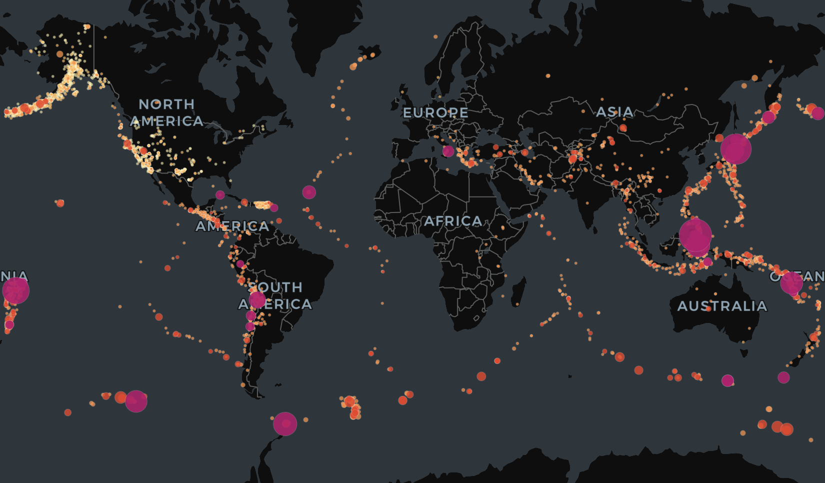
When you want something durable and shareable, you build a Project — a notebook that's like Jupyter, but more functional. The demo builds "Earthquake Explorer": a SQL cell that pulls the last 90 days into a dataframe, then a Python cell using PyDeck to render a beautiful interactive map of the Ring of Fire, sized and colored by magnitude.
From there, the built-in Notebook Agent takes over. Asked in plain English, it adds headed sections with a magnitude histogram and a daily time series, then runs a k-means clustering of earthquakes into six geographic regions — naming each cluster, mapping it with PyDeck, and charting the counts. Every step is proposed as a change you can inspect, confirm, or undo, and you can always open a chart's editor to fine-tune it yourself.
Building and publishing an app
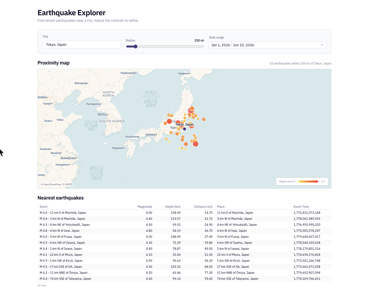
Next, the demo builds an earthquake proximity finder: a text input for a city, a numeric radius, and a date range. Hex uses geopy to geocode the city, computes each quake's distance, filters to the radius and dates, and renders the results as a map and a table — all from one detailed prompt, with inputs a business user can change without touching code.
The App Builder then packages it up. Beyond the classic drag-and-arrange layout, Hex's new generative app builder can rebuild the tool entirely — in one run it re-implemented the map in D3 and React — and publish a clean, shareable app. The result is a link any business user can open to find the biggest earthquakes near their city, no login or code required.
Claude Code connector and Context Studio
Because Hex exposes a connector, you can drive the same Hex agent from Claude Code. In the demo, a prompt in Claude Code ("compare earthquake activity in Seattle vs. San Francisco") spins up a real Hex thread, finds the right Supabase table on its own, and streams the analysis back into Claude.
The closing highlight is Context Studio. Data teams can see the questions people are asking, get warnings when an agent's answer was uncertain, and feed definitions, acronyms, and metadata back into guides and models. To me, this is what really differentiates Hex: if the answers aren't accurate, all the other features are for naught — Context Studio is how a careful data team keeps AI-assisted analytics trustworthy.
Why this matters
What stood out most to me is not just that Hex uses AI, but that it does so in a way that remains inspectable, explainable, and connected to the real work of analysts, data scientists, and business teams.
At Powered by Data, we care deeply about the intersection of humans, data, and AI. Hex is one of the platforms pushing that conversation forward in a practical and thoughtful way.
Transcript
Show transcriptHide transcript
Ben Jones: Hi everyone, Ben Jones here with Powered by Data. Well, in today's video, I'm going to give you an in-depth walkthrough of the Hex AI analytics platform. Now, what I love about Hex is that you know they're using agents to allow team members of a company, of an organization who's implemented Hex to be able to interact with their data in, I think, a really thoughtful and powerful way. So I want to walk you through that today. You know, and of course, this is a sponsorship Hex and our company have partnered.
And we're really proud about that. You know, in the eight years of running this company, we've never once partnered with the tool company until now. So we really think highly of what Hex is doing. And we're honored and delighted to be able to help out and to walk you through ⁓ the Hex tool and also for me to kind of share my thoughts about why I think it's so powerful. Okay, so I'm gonna share my screen to start here. And you know, this little diagram I think will give you an idea of why I think.
Hex is really helpful for organizations. So you can think of every organization. Maybe we've got some data scientists at the top of the skill pile here. You've got some data analysts in the mix here who also maybe use Tableau or Power BI or Excel. And then you've got business users at the bottom without all of those fancy data skills. But you know, there are a lot of them. And they're the ones using data to make decisions. Okay, so what I love about Hex is that they have a feature I'll show you called threads.
That really allows business users to perform tasks that you know typically data analysts would have to do. They also have agent-powered notebooks called projects that data analysts can leverage in order to really perform tasks that data scientists would typically have to do. And maybe most importantly, they allow data scientists and data analysts to better help out and communicate with the business users by publishing apps. Okay, so that's a general idea, and I want to walk you through that and show you kind of what it looks like. So
You know, I can take my hex.tech dot tech ⁓ account here and log in. So what I'm going to use for ⁓ the data set today for the demo, you know, I'm I'm from Southern California, so we're always so interested in in earthquakes, of course, for good reason. And you know, we have a whole earthquake catalog on ⁓ online made available by USGS and we can search earthquakes going all the way back to nineteen hundred. And so what I've done is I've created a Supabase
cloud warehouse that essentially it's just simple. It has one table, it updates on the hour every hour and it pulls in the latest earthquakes from around the world of magnitude 2.5 and higher. And in this database I've brought in earthquakes going all the way back to January 1st 2025. So a little about a year and a half worth. as you can see there are 41,000 such records here.
And so I can connect to that database here in my hex account. So I've logged into Hex right here. I'm logged in in a logged in state now with our partner account with Hex. And as you can see in the data tab on the left, we can take a look and see that that Supabase table is right here. And I can see all of the different attributes within it.
And so now this is you know connected. You could imagine connecting to your Snowflake database or data lake, your Databricks or you know AWS or GBQ, all of those different ⁓ enterprise grade data sources. And you know, also we can bring in other data sets as well, CSV files, things like that. Okay, so you know, a pretty robust set of data connections here within Hex. But
Let's just start with something very simple. And what this will allow you to see is how I believe that business users can perform tasks that typically data analysts would perform. And by the way, I have clients right now who say their biggest challenge is just getting simple lists to business users, maybe say marketers saying, Can you give us a list of customers who would fit the bill for a certain campaign? And that will become a bottleneck, really, believe it or not. And so of course that is not what we're looking for. we want to get beyond that, absolutely.
So let's say you're a business user and you know you want to know some things about these earthquakes. Well, you can just ask the question right here. Now, what this is going to do, let's put the question in there. Let's say, for example, all right, you know, what are the ⁓ 10 largest earthquakes in the past year? And give it to me by location, magnitude, and depth. I can just pose this question right here in this chat window in the middle. Now, what this is going to do is kick off a thread.
Okay, so you see threads, you can access threads, all the historical threads that you've used here on the left-hand side. And it's still in beta. But what I'd like to do here as well is add or tell Hex which data, which data source to use. So I'm going to specify that it should use the Supabase USGS Earthquakes data table. Now I don't have to do this. It will infer that and probably find it. And it usually does a pretty good job of figuring it out.
But why not help it find the exact spot that it should be looking? Okay, so I'm gonna go ahead and run this simple little natural language query. And so what happened now is it actually just opened up a new thread. Okay, so you can see that it's beginning the process of answering that question. And it's going to take a look and see if it can give me a little table, maybe, of the 10 largest earthquakes, you know, in the past year. And so
If you look here in this middle area, you can get a sense for what it's doing. So it's searching for tables, it's finding a table called Earthquakes. Okay. It's viewing that table. And now it's going to create a SQL query that returns just the top 10 earthquakes by magnitude. Now, if you're a business user that doesn't want to know all these details, that's fine. You can ignore that. But I would recommend you take a look at it. And you can actually, if you open it up here,
See the query itself. A very simple query. But what this is great is what's great about this rather is that you can really inspect exactly what it has done and see which attributes it's brought back, which table it queried, the exact clauses that it used to return the data, okay, and how it's ordering it and such. so we could ⁓ kind of look closely at what it's doing. And here's the output. You can see there was a magnitude eight point eight earthquake.
last year off the Kamchatka Peninsula in in Russia. And actually the ⁓ second largest was one from just a couple days ago here on June 7th in the Philippines. So that was magnitude 7.8. So you know that's great. We can see kind of that simple list. Again, as a business user, you know, you're empowered to just get it yourself. You don't have to go fill out a ticket or ask IT to give you a list. That is something you can just you know do yourself. But
It isn't all about tables and and lists. I mean, obviously, you know, I'm a big believer in the power of data visualization. So let's see if threads can make a chart for us. I'd like to see a monthly trend maybe of the largest earthquakes magnitude five plus. I want to find out what the shape of that trend is. Is it increasing or decreasing or flat? So let's run this kind of follow-up prompt within this thread to see if we can go beyond simple tables and actually create a chart here. And so let's see what it does. ⁓
It's going to try to find out maybe you know, how it can visualize this data for us. I didn't tell it what kind of chart to give me. I didn't really specify very much at all about what I was asking for. I just asked for a quote monthly trend, right? So let's see what it does, right? So we can we can look at the details here. You can see that it's already trying to kind of group these.
Earthquakes by month. And I can see the query that it used to create that. Okay, so how it groups and orders them, you know, by month. So that's useful. I can see kind of how it came up with these numbers if I want, right? These exact figures that it's going to now turn into a chart. Next it's going to visualize the data. It decided to create a line chart. And so that's what it's working on right now. So it's creating a chart cell, okay, within this thread that I'm working in.
And so again, you're a business user. You just want to get a chart here of monthly earthquakes, you know, over time. And there it is. So we can see all of our monthly earthquakes. It's returning it in a line chart. And I can see it looks like there was one big spike over here last July. Now, if I wanted to, I can even, you know, well, download an image or copy it to the clipboard. It's going to add some labels in here. It's just continuing to update it.
And if I wanted to, I can even explore this chart, which I love about this, because it's often the case, you know, that we don't get the exact chart we want in the very first prompt. And so what's great about what Hex is doing here is, you know, I could continue to ask the agent in threads to make adjustments. Absolutely, I can. But I can also just open the chart myself and make ⁓ changes, you know, to to what I see in here if I wanted to. and so there's lots of different kind of ways that we could.
perhaps want to adjust this line chart. But you can see already, you know, that the idea here and what I've been trying to illustrate is that what I love about Hex is it's empowering business users to directly query and visualize data from those connected data sources. And I think this is a really powerful thing. You know, they don't need to go ask IT every single time or someone in the data team to make a chart for them. You know, they can they can do that themselves and they can continue to interact in this natural language way.
So super powerful. But what I love is that it's doing it in a way that's very ins very explainable and inspectable. You know, you can go in and see exactly what it's doing and look closely at all these different steps it's taking and see the code ⁓ itself underlying the answers that it's providing. So that's key. That's really important. Okay, next up, I want to show how I believe data analysts can start to become
More like data scientists. So what is a data analyst? Okay, to me, this is a person who uses Excel or Tableau or Power BI or some other similar, you know, spreadsheet or drag and drop tool to visualize data, make dashboards, things like that. Often, not always, but often data analysts don't really know how to code. So you know they wouldn't find themselves writing Python. While most need to use SQL queries, often they don't know Python and they don't spend much of their time in in Python notebooks.
Of course, many do, but not all of them. So if you're a data analyst that hasn't learned to code, you know, what can Hex do for you? So I want to dive into another feature here of Hex, which I think is really powerful. We've talked about threads already, but we can actually go to the next level and build a project. Now a project is actually going to create a special kind of a a notebook. It's like a Jupyter notebook, but it's in some ways even more functional.
So I'm going to go to the projects area. You can see I clicked on projects. I've got some I've worked on already. I try to clean it up a bit for you all for this demo, but I'm going to create a new project, okay? I'm going to click on plus new project. So I've got a new project. I'm going to call this Earthquake Explorer. Now imagine you are a data analyst at an organization. You need to do some analysis of this data set.
Now, what I'm going to do to start, okay, because I know that I'm going to ask some questions that are going to require some different kinds of Python packages to be included in the notebook, all right? But as you can see, at a first pass, I can add these different kinds of objects. So I can add a SQL query or Python code. I can even add text for headers or explanatory paragraphs. I can drop in charts, I can create inputs.
These are some of the different types of blocks or cells I can create within hex. So pretty cool stuff. Let's start with the Python code cell here. And what I'm going to do is paste in here this little ⁓ statement. And if you're not familiar with it, what is it doing? It's installing some Python packages. What are the packages? Well, one is PyDeck. Okay, so what is PyDeck? That is a Python package that allows us to create really great looking interactive maps. So I'll add that one.
I'm also adding scikit Learn. What's that? Well, you've probably heard of that. It's a really popular and powerful machine learning package that allows me to use some machine learning algorithms like classification or regression or clustering. I'm going to create clusters of earthquakes and see how they group by region. So that's in there as well. And then lastly, I'm going to add one called geopy geopy is another package. This one allows us to turn a city name, let's say Seattle or Los Angeles or Tokyo.
into latitude and longitude coordinates and then to compute the distances on the surface of the earth between multiple points. So I'll just run this little cell so that I bring these Python packages here into this this Jupyter notebook. Okay, so there it goes. And you can see that it's just simply installing these packages here in the notebook. And so I can kind of collapse this a bit here to just get it out of the way. All right. So now that I've got those installed, let's start to create a notebook together.
All right, so first things first, let's just go ahead and SQL query, create a query of this Supabase database we've got here. All right. And so what is this query going to do? Well, it's going to return all of these attributes here: the ID, the title, the place and magnitude and depth, the latitude and longitude, and the time that it happened, okay, as well as the alert status. I'm going to pull these attributes from
Public earthquakes, I'm going to avoid anything that's null. Okay. And I'm only going to bring in the last 90 days. Now, what's really cool about this, and you can see that it's pulling this from our superbase data source up here in the top right. So that it's going to provide a data frame as an output. And I'm going to name this data frame earthquakes. Okay, so that's the output. I can now reference this exact table elsewhere.
So when I run this cell, I just want to point out you can run it in a few ways. Okay, so one way you can run it, if you see this little play button on the top right corner, and you see this little drop down arrow here. So I can choose to run this cell only, or I can run it along with everything upstream or above or downstream below in the notebook. And this allows us to control which code we're running because there can be dependencies between cells. Sometimes one cell needs another cell to run.
And sometimes we update one cell and we want everything below to, you know, kind of rerun to propagate that change throughout the notebook. So I want to point that out. This gives you a lot of control over what exactly you're running. And I think that that's a useful feature here that they've added to their notebooks. So we're going to go ahead and run this little SQL query here, you know, real easy. No problem. And there we go. We get a list of these earthquakes.
We can see the one in the Philippines from a couple days ago is up here at the top of the list as the most powerful earthquake in the past 90 days all around the world. Okay, that followed by one in Tonga, another in Indonesia and Japan and so forth. And again, this is a data frame. It's called earthquakes. So I can actually use that in a downstream cell. And it doesn't have to just be SQL, it can even be Python. So let's create another cell below it.
Now, this is going to be a Python script that I've already created ahead of time. So I'll paste it in here. And what is it doing? Well, it's using that PyDeck package we talked about before in order to make a really beautiful map of these earthquakes. We can see where they were. And so if I wanted to, I could look closely at this Python code and see that it's, you know, grouping by magnitude. I can see kind of how it's sizing and coloring each dot in the map it's going to create.
And all these other different clauses here and statements within this code block, this code cell. And so then I can run that. Okay, so then this would be really the case of maybe a data scientist, you know, who knows how to create a Python script like this. Now, as an aside, I created this exact Python snippet here using Claude code. So, you know, I myself didn't type this out line by line. and so I was able to get this.
But here you go, right? Here's our map of the earthquakes around the world in the past 90 days. And I can see the ones that are really large, like that one by the Philippines over here, or these other ones that we we noted were at the top of the list, you know. So there we go, you know, and so you might say to yourself, well, Ben, I thought you were talking about data analysts who didn't know how to code. So why did you start by copy and pasting this huge snippet in there? You know, if you're a data analyst who doesn't know how to code, you're not gonna be able to do this. And that's totally true.
⁓ unless you are are using a coding agent, right? ⁓ to help you create that code, again, which is the case for me. But what I want to call out here is that what Hex has done is they've added to this notebook feature an agent. And you can see there's these agent call-outs here. I like to open up the agent on the right hand side here in this right-hand panel. And so if you're that data analyst and you want to continue to further analyze this data, but you don't want to write code or use a coding assistant.
then that's fine. You can actually just use natural language and you can use basically the coding assistant right here inside of hex. Okay, so let's try this out a bit. Let's ask this notebook agent right here to create a couple ⁓ charts for us. Okay, so we're gonna ask it to create two charts. One is we're going to first of all use that Earthquakes data frame we created up at the top, and we're gonna add two cells with a markdown header.
Each one has its own markdown header. The first one is going to be a histogram of magnitudes. And the second is going to be a time series of daily earthquake counts this time. Okay. So I'll run that and I'm going to let this agent do its thing. So what is it doing here? Okay, well, we can watch and follow along and look closely at its steps and exactly what it does to try to resolve this prompt for us. Okay, so it might take a while, but during this time, while it's working.
I really recommend you, especially at the beginning, look very closely at what it does. So it's getting started. Let's let it do its thing. It gives little tips in there, which I like, which you can follow along. But you can see it's going to add two headed visualization sections. So already we've got these two sections. Okay. And it's going to pull from that existing Earthquakes data frame and make sure that it renders.
And now it's going to figure out how to delegate these tasks to different agents that are going to take part of the task and get that done. Markdown cells and visualization cells. All right, so it's working along. Now what is it going to do? Is it's going to propose changes to the notebook that we can either accept or decline. One is called undo and then one is called confirm. So let's let it make its suggested changes.
You can see at the bottom here, we have a little record of the changes, along with the ability to either undo it or confirm it. If you click this arrow, you see exactly what it does. So its first change is to simply make a magnitude distribution header. Okay, so this is basically a little text box that it's going to add here. Actually, I think it, yeah, it created this just simple header. And then we've got our histogram. There it is. So you can see it added a magnitude histogram.
That's funny, it created the header in Python instead of just using a text box. So there's a variety of ways to get the job done. But you can see it's already got a histogram in here by earthquake magnitude. So, you know, of all of these 6,600 earthquakes, little little less than half of them are magnitude four to five. And then below that you can see is it's got my header for daily earthquake counts, and it's got this daily ⁓ line chart. And so, you know, as a
As a data analyst, you can go ahead and not just look at the output here from the agent, some of them Python, some of them just simple chart objects, right? But I can, again, just like with ⁓ the threads, I can make some changes. Like let's say, for example, I looked at this histogram and I said, you know, the problem is it seems to indicate that this first bar is magnitude two to three. But like I said at the beginning, you know, I only brought into the superbase database starting at magnitude 2.5.
So this might be a little misleading. Someone might think that this is covering the 2 to 2.5 magnitude as well, but it does not. So I could, if I wanted to, just you know, type a question in here. by the way, I'll confirm those those changes now so I can I can bring them in. And now they're not proposed changes anymore. They're actually in the notebook, which is which is great. But as I said, I can actually make this edit or change to the histogram myself. You know, again, if I wanted to, I could type in my requested change, but
I can also just click on this icon saying show editor panel. All right. And within here I can see that it's breaking out the magnitude by bins and it's giving me 10. But maybe instead I want to specify a step size and make sure that it's only 0.5 on the Richter scale. So bins of 0.5 steps. And now when I close this panel, I can see that I start at 2.5. I go 2.5 to 3, which I think is maybe, you know, a little better and a little less misleading there.
In terms of ⁓ the kind of histogram that we've got here. You know, I can also see, wow, you know, there's this huge spike of earthquakes on April 2nd. So, you know, what's going on there? Why were there maybe so many of these? And I could, you know, drill down into that if I wanted to and see what happened on that one specific day. So, you know, I could follow up and say, you know, show me only earthquakes from April 2nd.
And that might be a way again for me to you know just continue to go through this diagnostic data analysis to drill into the data further. But instead of that, I want to show how a data analyst can use machine learning. Maybe they don't really ⁓ do that quite often, but ⁓ let's use that k-means clustering machine learning algorithm to group our earthquakes ⁓ by region or by geography. Now, again, this is requiring that
scikit Learn package we brought in at the very beginning. So we're going to leverage that now. But instead of writing the code ourselves in Python, we're just going to ask the agent to do it for us and give us a starting point that we can inspect and review. So I'm going to ask it to group the earthquakes into six geographic clusters. We'll use the K-means clustering algorithm. And we'll use that just on latitude-longitude alone. So it's sort of a simple grouping ⁓ scheme. We're not going to include magnitude or depth at this point. All right.
And then what I want it to do once it creates that is actually plot each of these earthquakes using that PyDeck beautiful map package we showed before and give them a name, give them an actual meaningful name instead of just you know cluster one, cluster two. So let's set it to work now. It's got a lot to do, right? What does it have to do? Well, create the groups, find which earthquakes belong in which group and label them as such. It's got to create a map out of it, and then it has to actually.
come up with an idea for what to name each of these clusters based on where in the world those earthquakes were happening. So let's let it do its thing. So quite a number of steps here, you know, that ⁓ that are are kind of coming together in order for us to carry out what I would consider to be, you know, a more advanced analytics kind of task. One that someone who's just used to making dashboards all day, you know, this might be
above their their skill band, but but again with hex I think that you can see that it will allow us to level up. I really recommend for an advanced task like this you look really closely at what is it doing step by step. Okay. So we're going to actually kind of see exactly what is it doing. These are the steps from before. Now we've got our grouping prompt. So what is it starting with? Well it's going to cluster my earthquake's data frame, that one that we used or created with that
SQL cell at the very very beginning of this notebook. It's going to leverage it yet again. And it's going to inspect the cluster summaries to name them, coming up with sensible names. This is something that's not in the data itself. It needs to infer geographic names. So it's really using some of the LLM capabilities here of this of this foundational model that we're tapping into here with this agent panel. So it's starting off by creating the clusters. We can look closely at what it does here.
There's a change already, right? It added K means geographic clusters. So I can see how it did it. And I can look closely at this if I wanted to. And I could copy it and inspect it and have maybe an expert data scientist in the organization give their feedback about it. I could also put it into an A another AI coding assistant to have it provide ⁓ feedback on the kind of of
machine learning algorithm that it's using and how it's setting it up and so forth. Okay, so but I can look closely at that if I wanted to. But I can see also that it's giving me an output with cluster numbers and cluster names. So the first cluster would be earthquakes that are in the Alaska Aleutians North Pacific area. Cluster number two would be Japan, Philippines and the West Pacific, and so on. And so I can confirm that change if I wanted to. What is it doing now? Well it's actually
Trying to delegate now the creation of the map and the bar chart. So it's going to take the instructions or my prompt and divide up the work between other agents, sub agents that it's coordinating. And each of those agents are getting the job done. You know, one creating the map here using PyDeck. We can see that one coming into view now. All right. So that one's getting created here. We'll see how that goes. There it is, as it appears, and coloring them by the clusters.
so we can see them grouping. Okay. So I can hover over them and see exactly what the title is. Okay. The next one down here is giving me the bar chart of all of these same clusters. And so that's real useful there. And I can again, you know, confirm all of these changes ⁓ if I wanted to.
So I can confirm these changes. But you see that you know this is really a great way to build out a notebook to create charts and graphs using Python to look closely at what those charts, how they were created. Okay, so it's going to continue to kind of make small ⁓ fine-tuning adjustments here to the charts I've asked for, which is great. But what I want to do next, okay, is show you how both
Data scientists and data analysts can really ⁓ better assist and empower business users by creating apps in hex. This is huge. Because again, you know, I wouldn't really want to send this notebook to someone in the business. They would be wading through these code cells and just feeling a little lost, I would imagine. I'm almost positive that they would kind of just not know what to do with it. So this is where agents can come in ⁓ really handy.
So what are we going to do now? We want to actually build an app that lets the business user, let's say, for example, put their city in there, maybe, let's say, and you know, then also be able to maybe put in their city and see all of the earthquakes, you know, kind of in their area. So we're going to build in our in our notebook here, kind of a new, a new area down here below.
And this is going to again allow a user to type in their city, see all the nearest earthquakes. In order to do that, by the way, it needs to use this geopy doesn't it? So that's critical. So I'm going to ask the agent to build me an earthquake proximity finder. So you start off with a text input with a city name. We'll start with a default being Seattle. There's going to be a numeric input for how far away do they want to see earthquakes, and then a date range, so I can say start and stop.
It's going to use Python, okay, and Geopy to geocode the city. What are the latitude-longitude coordinates? It's going to compute the earthquakes, every earthquake's distance from that city, and then only keep the ones within the radius that I've specified and the date range I've specified. And it's going to put all that in a nice map. So let's send that prompt. Again, very detailed request now, right? This is a prompt with kind of multiple steps numbered out. I've asked it to kind of
leverage some of these additional functions we haven't talked about yet, like inputs, a way to let a business user make inputs and changes to the the variables that the code blocks or cells ⁓ reference later on in the notebook so that a business user doesn't have to rerun the code or think about editing the code. They can just change those inputs. So now it's again it's going to divide up this work and it's going to you know have multiple agents get to work for us.
To create this proximity finder with the idea here that we've gone beyond just maybe exploratory analysis. And now we're trying to create a very specific app that lets a user do a certain task, carry out a steps of a task. We're thinking about that workflow and what they need to do. In this case, maybe they want to find all the earthquakes in a certain radius around any city they want. Okay, so I'm gonna create the app and then first of all, we'll build it here in the notebook. Then we'll see how we can.
package it up and clean it up so that we can push it out there and publish it to the business and send a link to a business user to let them get the job done. So here we go. The agent is still working along here. It's starting with adding inputs, blocks. It's needing to compute, the proximity, how close is every earthquake to the chosen city. We started with the default of Seattle. You can see these input blocks now have been added.
And you'll see those, of course, in the pending changes. It added the city name, the radius, and the date range. Those are all added now as little inputs here. And you can imagine, you know, you could change these however you wanted to. We'll let the business user do that in the app eventually. But it's still building it. Now it needs to know okay, well, given a certain city and radius, can I return a list of earthquakes within a certain distance from that city?
And that's where it's going to have to do some Python here to compute those distances. you can see it's going to use these three inputs, okay, in a new Python cell in order to be able to figure out how far away earthquakes are from the chosen city. I'm gonna confirm these changes while we're kind of letting it work ahead, but it's still doing the job of converting.
these chosen inputs into our app that we want to push out there a map showing the earthquakes as well as a table I think so let's see now here we go so it's using that geocoders the geopy package we talked about that's this one over here to compute the latitude longitude of the city okay so it's starting with the city it's got to figure out the latitude and longitude of the city
Okay, and it's using variables here, which is really nice because then if I change this city name, this code will basically run against a different city and find its coordinates as well. So I don't have to look them up every single time, you know, manually. And already I get a list of earthquakes in the area. Okay, so I can see these are all in Washington, which makes sense because they're close to close to Seattle. the changes that are teed up and ready to go would be the Python cell about finding nearby earthquakes and the
The table here that allows us to see what those earthquakes are. Next up, it's working on here's the SQL query, isn't it? That allows us to see a nicer formatted version of these of these earthquakes, maybe in a table. So we've got a Python cell, we've got a SQL cell, another Python cell now is being added below, which is pulling PyDeck. Okay, PyDeck, you remember now it's this nice.
Formatted interactive map package in Python. So it's tapping into that package next. And you can imagine what is it doing? Well, it's going to use that to create this map. and I can see Seattle, I can see the earthquakes around it. There's my proximity map, and I can confirm these as well. Okay. So that's looking pretty good. And let's see now for you can imagine, right? I could here change the city.
And we'll see what that will do. But for now, let's let the agent continue to do its job. it's still doing some more work here. and let's see what is it doing specifically. you can see kind of what it's pondering, you know, it's sort of quote unquote thought process, even though of course it's not a person thinking by any means, but you can see the process that the model is following to try to.
Carry out the steps of the prompt. It doesn't understand why the date is undefined. Okay. Maybe it's because up here these dates are not filled in. I didn't tell it what to use, did I, for the default date range. So I can give it its own range. Let's go back to maybe the beginning of the year, let's say, you know, and go up until today. And we'll specify that for the date range, try to help it out a bit, maybe. Okay.
And we'll run this and everything downstream to apply this date range just for this year alone. And we'll see how that affects the rest of the cells. it has a change in here already, which is making a modification to finding nearby earthquakes. So it kind of is debugging. It's saying, well, you know, I I created something, but I can see now that I need to make a change to it. So we have left hand side, right hand side, left hand side tells us what it was at the beginning.
right hand side ⁓ shows us what has changed about it. and I can go in and inspect that I guess here and see, you know, that it's trying to fiddle with the start and end dates and make sure that those are referencing those inputs. So it kind of got started, but it made a mistake. ⁓ and it's trying to correct that mistake to fix the date range that it's providing here. Okay, so we can confirm that change.
And again, you this is where you can look really closely at each one of these. You can be really carefully inspecting every one of these cells to try to see, you know, what it's doing, try to see if it's performing the task correctly. And this is where it really is helpful to have a data scientist on the team who, especially for mission critical kinds of apps, can review every one of these steps, can review everything, inspect it really carefully and see what's happening. Okay, it looks like it's done now.
So it's built this proximity finder. And ⁓ and we're gonna go ahead and run with that. So next thing we can do maybe is we can publish this, right? So we can build this as an app. Now, so we switch from the notebook side of this project to an app side of the project. Because as I mentioned, you know, if I'm going to send this to a business user, I probably don't want to send them this. They're just gonna get lost. So I can give them a nice more packaged version of it.
Now the app builder has a classic app. What this lets you do is kind of arrange the notebook you just created, hide things, delete things from the app itself, arrange them, drag them around, and kind of put them in a way, that I think is nice and useful. But what they also have now is the ability to use this ⁓ generative app. It's brand new. So I'm going to ⁓
You know, kind of tell it, tell tell a generative AI agent sort of what I want this app to look like. So let's kind of take this app. We're gonna put the inputs on the top, we'll put the map in the middle and a table below. And I want to create this, you know, as an app that I can publish to the business. So it's going to try to build that app for me. Now I find this really interesting. I was playing around with this before. It goes to pretty great lengths to adjust. It doesn't just simply move around the existing cells and objects.
Sometimes it redoes it. Sometimes it uses a totally different tool. One time I did this when I was warming up for this demo yesterday and it created a D3 and React application. So it it really kind of looked at it and said, well, I'm gonna build this a totally different way. So let's see what it does here. You know, ⁓ we're just simply asking it to create an app out of this earthquake proximity finder little tool that we made. Again, it's a really designed to be able to go from, you know, this database here.
⁓ through some Python cells and output a tool that anyone can use because you know the business user doesn't always want to have their hands in the data set itself. The business user definitely doesn't want to have to look at or edit Python code or even SQL queries. And so again, Hex is allowing these top tiers of the skill pyramid to be able to communicate better and provide tools for business users through this app.
Builder. Okay, so again, you can manually build it yourself if you want to have control over every object and where it's located. Or if you want to ⁓ turn loose this generative agent, you can ask it to take your notebook and build an app. So in my experience, this can take some time. So y when I tried this yesterday, it took about six or seven minutes to create the app. So I might pause here and we'll just fast forward ahead a bit to kind of see what the outcome is.
of this app building process as this generative app building ⁓ tool gets to work and tries to create something that looks great that any business user can use. Okay, so when I come back, I'll let you know exactly how long this agent ran for and and we'll talk about well, what it created. Let's see what it makes.
Okay, we're coming back here. You know, it's been running for about five or six minutes, I guess. And again, it's rewriting this map in D3 because it can't bring over that PyDeck map for some reason. So, you know, quite a lot of work it's being done here in JavaScript and React to kind of recreate what we need to push this out as an app. So, you know, it's not trivial what it's doing here. And we can look again at this code very carefully if we want.
Every one of these different objects that it's using as it's creating this basically a JavaScript application here. And we can preview it. So here we go. We've got ⁓ you know, this earthquake explorer here. I got Seattle in the middle, got a nice map and the table of earthquakes. All right. I could change this maybe. Let's change this to, you know, Los Angeles. Okay. And maybe instead of ⁓ let's pick a date range of maybe go back to May.
until today. we can, you know, change the radius. And that will add or take away some of these. Maybe instead of looking at a country in the United States all the time, we can go outside. Let's go to Tokyo. Okay. So we can go to Tokyo. we can change the day range there if we wanted to. So there we go. We got this really cool earthquakes proximity finder, you know, kind of seeing
All the ⁓ earthquakes and the largest ones and how far away they were, all in this app, right? So we can publish this app now and we can publish the app and actually share it with our business users that we can send now it as a link. So when we send the link, you know, then we can send it to review if we want. I highly recommend that if you've created this and you need someone else to take a look at it, but
Ultimately, we're going to get a link out of this. And so all of that insight, all of that Python, and we can even, you know, kind of see kind of this whole, this whole application here loading as it loads. We could send this link to any business user and they would then be able to check it out. So what is that? That's the final kind of linkage here, isn't it, of kind of going from data scientists and data analysts kind of back down to those business users. A couple more things I just want to show. So there it is in the final, in the final view of it.
⁓ you could actually, if you wanted to, kick off a thread using Claude Code itself. So I've got a desktop application running here of Claude Code. So I'm gonna make a new session here. Okay. We'll connect it to that Earthquake sync. But I can say, hey, you know, ⁓ use my hex account and connector.
to compare earthquake activity
in Seattle to San Francisco.
Okay. Which had more significant activity, seismic activity. All right. So there we go. So we can actually, you know, use what now what is it going to do here? Because I have this connection, this connector here. If I look at the connectors, there is there is a hex connector in there. Okay. And I can see that it's connected to, you know, my account. I can disconnect it if I wanted to.
It's going to actually create a thread. So that's what it's doing. It's actually creating a hex thread. So I'm going to move this one over a bit here. And let's go here in in hex to check out our threads while it's working on it. And if I go to see the list of threads, I can see that it's got the Seattle San Francisco earthquake activity. This is the thread that it's actually creating for me right now. So Claude Code is running it.
And it's doing its work over here. And so, you know, it's it found that earthquake table, the one from Supabase I didn't tell it to go find it, it found it itself. and I can make sure it found the right one. You know, if we had multiple tables with similar names, I could I could look at that and be aware, maybe. And now it's creating a SQL cell here in the thread to compare Seattle to San Francisco. All right, and it looks like it's going with a certain radius, certain number of earthquake counts, and the magnitudes.
And so I can see the output on either side within the thread, or you know, here in Claude Code as well. It's going to give me the output and the outcome of this, of this simple little comparison that I'm conducting here of these two cities. All right, so nice little connector there, especially for those of you who have really gotten into claude code like I have. And you know, you can see the comparison here in Claude. You can see a nice write-up ⁓ by Claude about the difference here.
Looks like San Fran has much more. We all knew that, but you know, there you go. Last thing I'm going to wrap up with here is just something that I think is really powerful. It's this context studio. Now you can imagine, okay, so we have all these users of data, but we also have the data teams themselves. These are people managing the warehouses and data lakes, the tables and all of the you know, kind of metadata that goes along with it. Well, what they can do, which I think is so amazing, okay, is look at the context.
So they can take a look and see who. So here you can see, well, Ben has been asking certain questions in threads and notebooks. And they can actually get little warnings if a question that I asked sort of resulted in an uncertain answer by the agent. And so we can find out, let's say if there are maybe some definitions or some acronyms that haven't been properly defined. And we can actually put that back into guides and models and repositories, kind of adding that context. So context studio to me is.
A feature that really differentiates Hex from all the rest. I'll end on that because I think it's a real high note. You know, what is it doing? Well, it's giving people in the business the ability to make sure that all of this is giving accurate answers. I mean, if it doesn't give accurate answers, then all of these amazing features are for naught, or even worse, they're going to be for harm. So, you know, a data team that's looking very closely and carefully can use Hex and the context studio.
To keep a close eye on these different interactions and seeing when things are not quite lining up, to be able to make sure they add some of those definitions and metadata to really make the answers much, much more robust. All right. Well, that's all I got. ⁓ you know, again, huge thank you to ⁓ my contacts over at Hex, Rachel Herrera, the product evangelist who I interviewed on the Powered by Data podcast a month or two ago.
really think highly of the work she's putting out there. I've been able to share some of her amazing articles with my students at the University of Washington. Of course Charles Schaefer. Charles and I worked closely together at Tableau for many years. He was actually my "sous vizzer" when I was up on stage doing Iron Viz before I even joined Tableau so many years ago. So so excited to see, you know, them move on in their careers and just continue to do more and more great things. And all the rest of the folks at Hex that I've had a chance to meet and interact with.
Again, you know, bravo to you all for this amazing tool you're building. Wish you all the best. You've been on a tear lately creating just launching feature after feature. So some good stuff there. And you know, you have a good position now, I think, to to continue to move us forward, right, into this this AI-driven analytics future we find ourselves in. a lot of power and a lot of potential, and of course
Some problems we need to get on top of and make sure we're managing carefully. And I think that's what Hex is really trying hard to do. ⁓ so hats off to them. And again, thank you. Thank you to my listeners who have watched this video. Hey, please like or comment and you know, let me know what questions or thoughts you have about Hex, about other tools in this same space. Let's keep this dialogue going. You know, there's a lot going on and we need to stay on top of it together. So let's keep that conversation going. Well, that's all for now. Take care, everyone, and we'll talk to you real soon. Bye.
Ready to get started?
Let's discuss how Powered By Data can help your organization get real value from data, BI, and AI.
Let's Talk